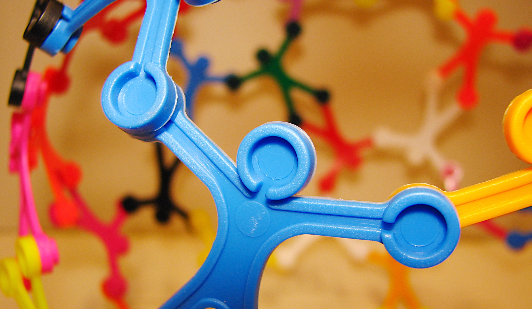
Strengthening the Identity for a Better World


Iles de Paix is an international Belgian NGO, founded by Father Dominique Pire, Nobel Peace Prize laureate in 1958, which works to improve the living conditions of vulnerable people and promote global solidarity.
Challenge
To create a brand identity for Iles de Paix that reflects its values of solidarity and improving living conditions, while modernizing its image to attract a younger audience. The goal was to give new meaning to their well-established symbol, the “little man,” while enhancing the brand’s recognition.
Strategic approach
Repositioning Iles de Paix as a dynamic and modern entity capable of engaging a new generation of donors and volunteers. Developing a brand architecture that emphasizes the idea of building a better world together, relying on values of solidarity and cooperation.
Creative solution
**Design**: The visual identity is intended to be contemporary and dynamic while capturing the spirit of Iles de Paix. The revamped logo, based on the famous “little men” inspired by Leonardo da Vinci’s Vitruvian Man, symbolizes openness and solidarity. The colors and typography were chosen to reflect a welcoming and accessible image.


