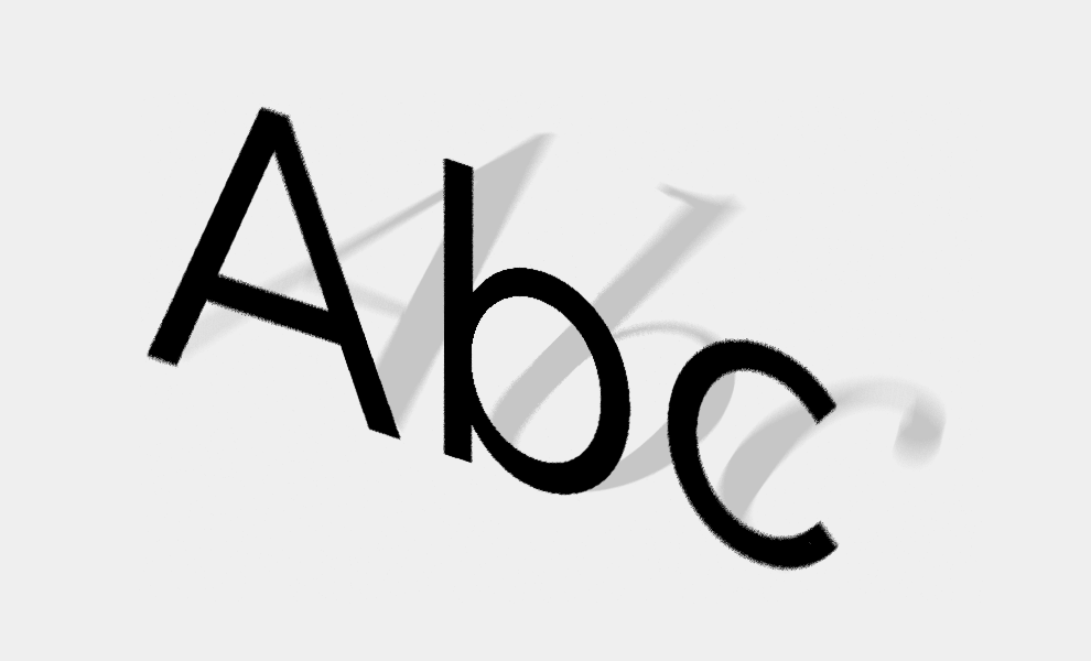
5 tips on typography
10 September 2020We all know and recognise that typography has its own character. So it’s not a choice that you should leave to chance.
#1
Approachable or well established?
Use capitals if you want to come across as determined, and lower case - even for the initial of a name - to express proximity.
#2
History vs. modernity.
If you want to position yourself in the present day, choose a sans serif font, but if you want to come across as a benchmark, go for a serif font.
#3
'Italicise' with care.
Don’t abuse italics, as they tire the eye, especially when using all capitals.
#4
Let your letters breathe.
While some brands try to make it their style, avoid putting letters too close together, and make sure they look balanced - which doesn’t necessarily mean being mathematical about it.
#5
Use contrasts to your advantage.
If you cannot/don’t want to choose one family of fonts, highlight the difference and change register (a simple, unpretentious font for a script or handwriting for example).